 
        
      
    Chipmong Land
PHNOM PENH, 2014
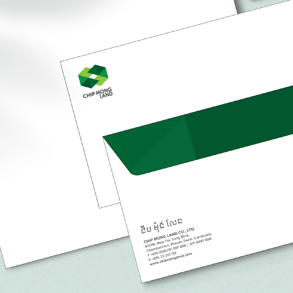
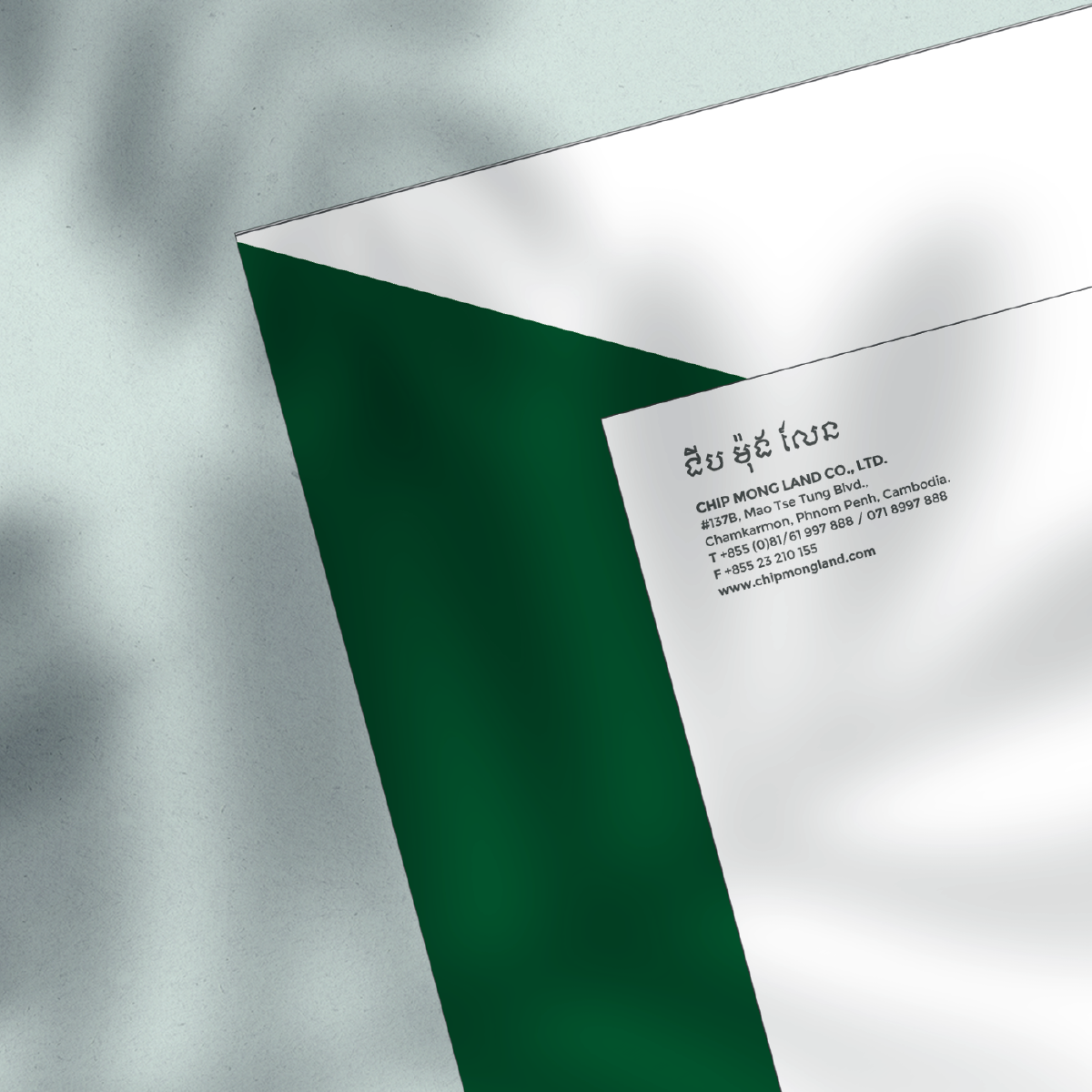
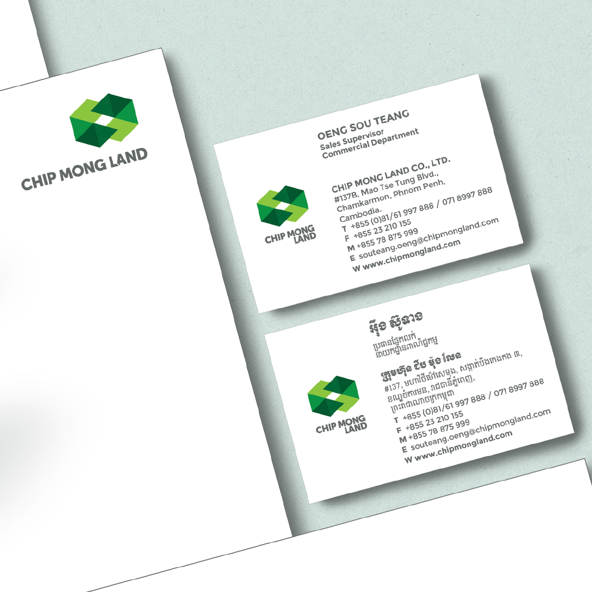
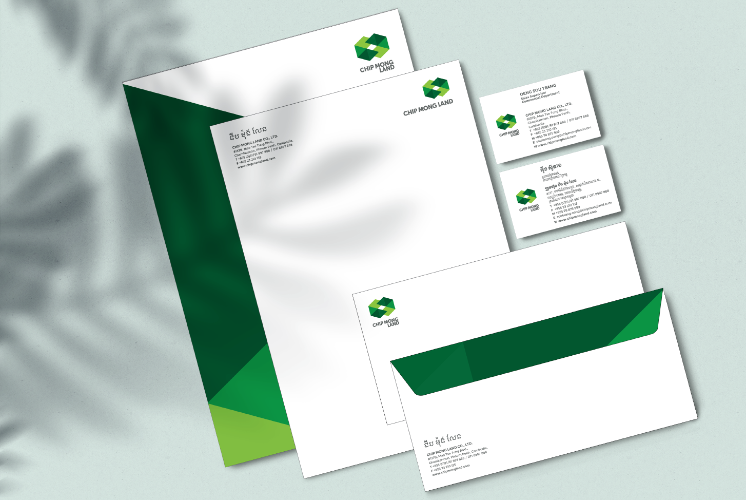
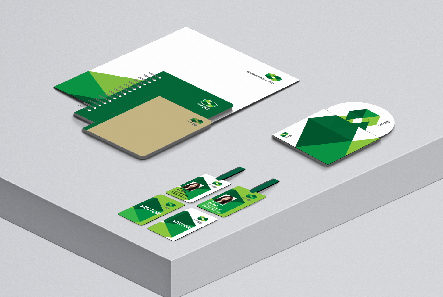
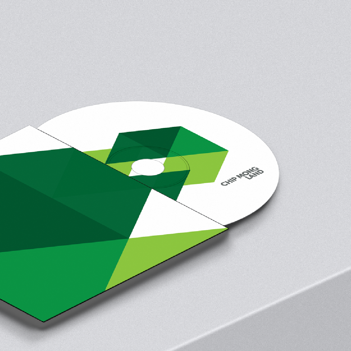
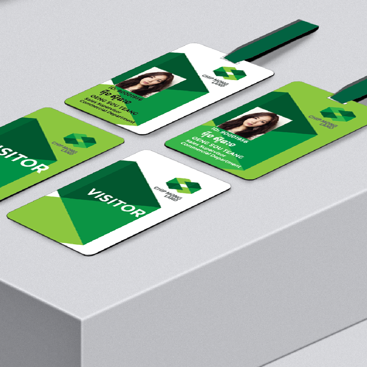
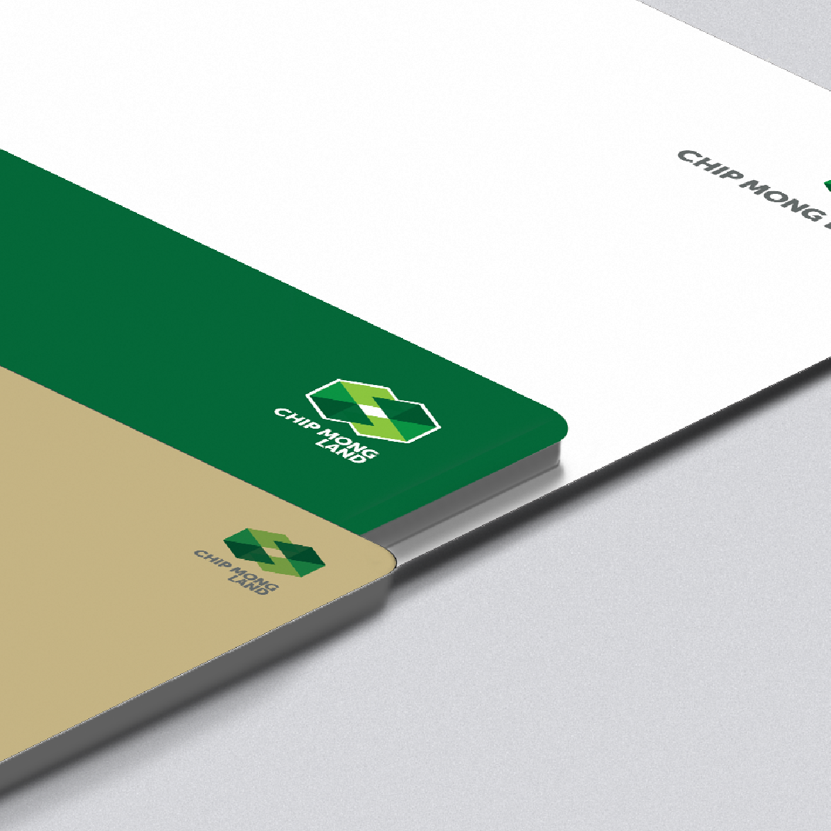
A large-scale real estate developer from Cambodia required the C to be green for good luck. The design of the logo and identity is executed into the letter C whose form and corners are simplified and interplayed into a new symmetrical details and colors. The final result is the image of a steadfast real estate company that strives to develop new physical spaces.


            The final result is the image of a steadfast real estate company that always strives to develop new, physical spaces.
 
            The design of the logo and identity is executed into the letter C which are simplified and interplayed into a new form with new symmetrical details and colors.


            